Ledlenser
OVERVIEW
Ledlenser designs premium flashlights, headlamps, and portable lighting solutions for a wide range of use cases including outdoor adventures, sports, and professional applications in industry, infrastructure, construction, and safety-critical environments.
I led the end-to-end redesign of the Ledlenser online shop. The work included UX research, information architecture, and a full redesign of the commerce experience across the entire store. The main focus areas were the homepage and product detail pages, along with the checkout process and overall user flow. I also created a scalable design system to ensure consistency across the experience.
ROLE
UX/UI Designer
TEAM
1 Product Manager
4 Engineers
1 Designer (me!)
TIMELINE
Jan – Jul 2025
SKILLS
UX Research, IA, UI & Design System, Interaction & Responsive Design
The core insight
Ledlenser makes hardware trusted by rescue teams, industrial crews, and expedition athletes, but the shop presented it like any commodity torch.
Critical specs were buried in low-contrast accordions, forcing shoppers to leave just to understand what they were buying. The result was a premium brand with a mid-market presence: variants looked alike, reviews were invisible, and a fragile checkout dropped people back to an empty basket when their session expired.
Goals
Make the shop feel as premium as the products it sells.
Surface technical specs clearly, instead of hiding them in accordions and PDFs.
Help users compare product variants and buy with confidence.
Remove checkout friction and eliminate the session-timeout data loss.
Research & Insights
To pressure-test assumptions, I paired a competitive analysis and heuristic UX audit with primary research: customer surveys, interviews with the support team, and workshops with stakeholders and the developers who own the shop.

Ledlenser's audience splits into two groups: the established professional core, craftsmen and rescue crews who need rugged, long-lasting gear, and a broader, younger audience of outdoor athletes and everyday users who are more price-sensitive and shop by activity, not by product series.

Who I designed for
Rather than invented personas, I grounded the work in Ledlenser's three real buying audiences, confirmed by the interviews, each shopping with different priorities and levels of product knowledge.
Professionals. Craftsmen and industrial crews who need durable, job-proof lamps. They trust brands and colleagues over online research, and read specs selectively: lumens make sense, but protection ratings often don't.
Outdoor & athletes. Runners and hikers who compare by activity, weighing runtime, weight, and beam distance far above brand or series. Every gram and every detail of the light matters to them.
Everyday users. Gift buyers, first-timers, and casual outdoor users (camping, garden, dog walks) who care about warm, comfortable, reliable light over specs. They want plain-language guidance and reassurance ("best for everyday home use") to choose with confidence.


One insight cut across every segment: no participant understood the Core / Work / Signature series naming, the professional included. Everyone shops by activity, not product line, and wants specs in plain terms ("rain-proof", not an IP code) rather than numbers.
Defined Focus Areas
One premium experience, from first impression to checkout
From the interviews, I defined what the redesign needs to solve: a premium, cohesive experience where shoppers can understand, compare, and buy without leaving the flow.
What I'll tackle:
Redesigned homepage, leading with brand storytelling, immersive product imagery, and clear category entry points.
Activity-based navigation, letting users enter by what they actually do (work, running, camping, home) instead of decoding the Core, Work, and Signature series names.
Scannable product pages, replacing hidden accordions with clear tabbed sections, a sticky anchor nav, and a clean spec layout.
Plain-language specs, translating codes into meaning (IP rating becomes "rain-proof", lumens become "bright enough for the garden").
Side-by-side comparison, so users can weigh models on what matters to them: runtime, weight, brightness, and protection.
Visible social proof, surfacing reviews and ratings right where decisions are made.
One-page checkout, with a guest/login choice and a live basket that never times out to an empty cart.
Exploring references
In a cross-functional workshop, I ran a moodboard session with e-commerce references, using votes and sticky notes to flag patterns worth keeping and open questions around gradients and navigation. It set a shared visual direction for the redesign.

Information Architecture
I restructured the shop around how people actually browse — by use case and product family rather than internal catalogue logic. A clearer taxonomy, consistent variant grouping, and a global product-finder move users from category to the right model in fewer steps.


Where shoppers got stuck
Across the interviews and workshop, the same frustration surfaced again and again: people couldn't tell the Core, Work, and Signature series apart, by far the most common blocker when choosing a lamp. Specs like lumens, runtime, and IP ratings were hard to interpret too, especially for newcomers who just want to know if a lamp is bright enough for the garden. Many fell back on word of mouth, because the shop made it hard to find the right lamp and didn't convey Ledlenser's premium brand.

Design
Results
The redesign brings everything into one premium commerce experience. Clearer product pages, visible reviews, and a rebuilt checkout work together to improve product discovery and buyer confidence across the funnel.
Immersive brand storytelling and clear category entry points make the range easy to explore from the very first screen.
Everything that matters, up front
Key information sits above the fold: series, rating, variant, and price. The gallery stays sticky while scrolling, keeping the lamp in view until the tabbed section takes over, all designed to feel premium and match the product itself.
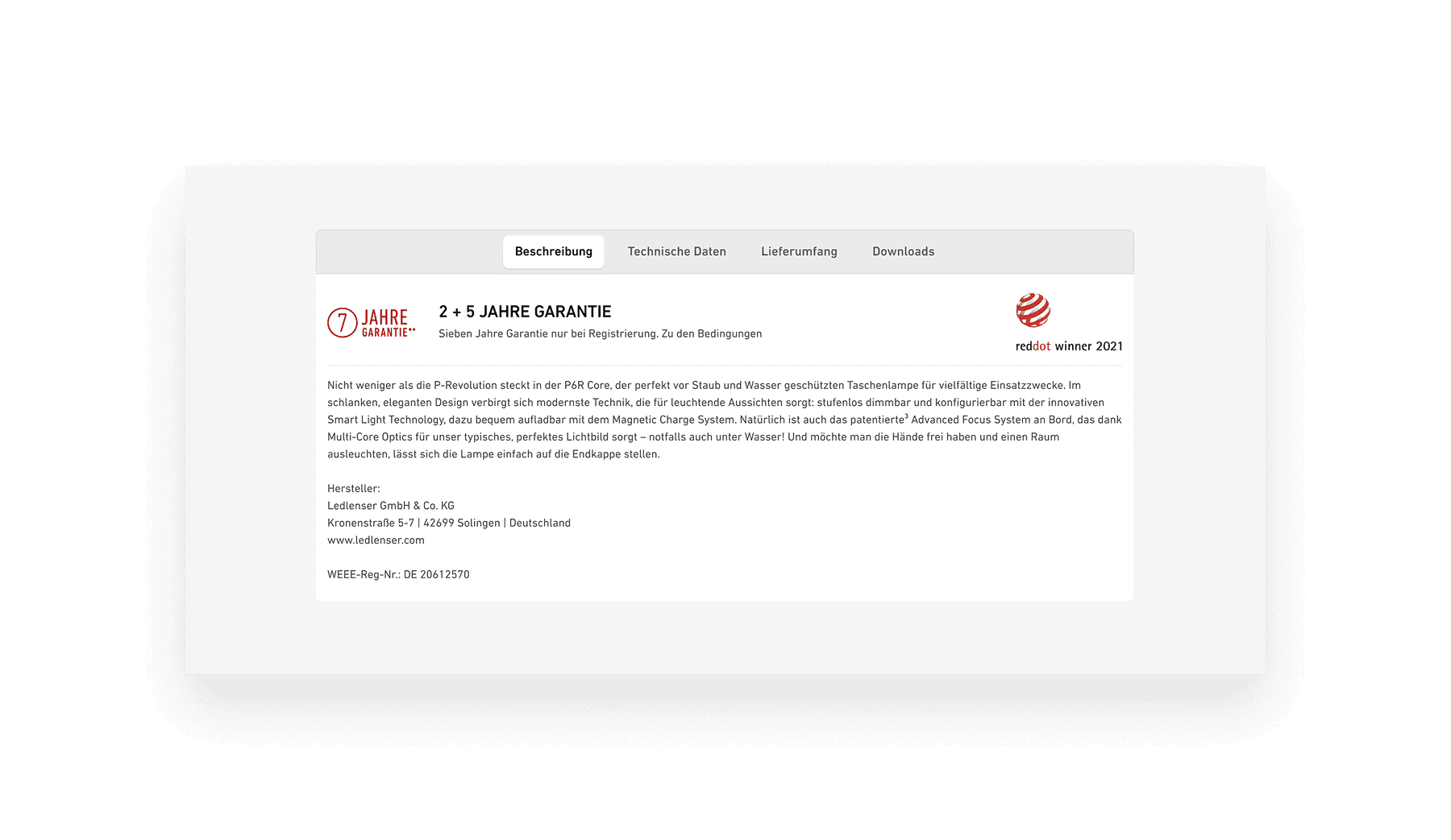
Key information is split into scannable tabs (description, technical data, scope of delivery, downloads), so users find what they need faster instead of digging through PDF catalogues. The download is still there for anyone who wants it.
A side-by-side view lets users weigh Core, Work, and Signature on the specs that matter, so the difference between the series is finally clear before buying.

Visible, marketplace-grade ratings surface social proof right where the decision happens, giving buyers the confidence to move on to checkout.

A checkout people can trust
Testing showed shoppers hesitating at checkout, unsure if it was secure, while a session-timeout bug emptied carts. The redesign puts it all on one page: a guest or login choice, a live summary that never times out, inline validation, and familiar payment methods.
What I learned
The biggest lesson was that perceived quality is a UX problem, not only a visual one. Premium positioning collapses the moment specs are hidden or checkout feels unsafe — trust has to be designed into every step of the journey.
Next steps: extend the design system across the full catalogue, add a guided product-finder for first-time buyers, and instrument the new checkout to keep validating the confidence gains in production.
